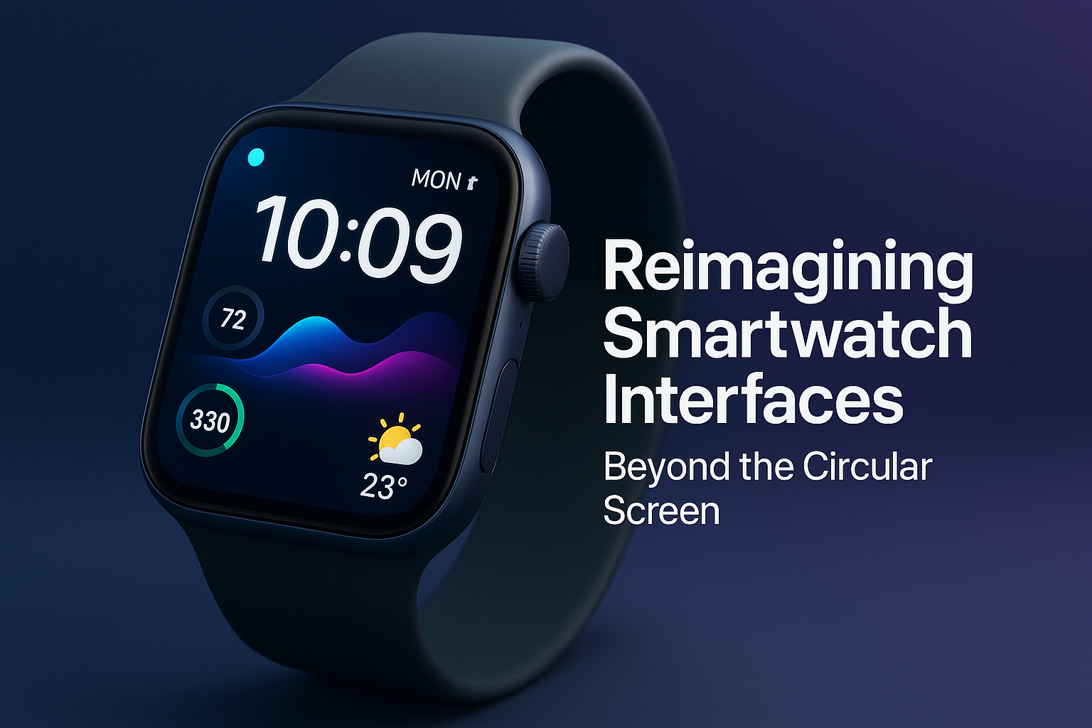
Smartwatches have evolved far beyond simple step counters and notification mirrors. Yet many users still struggle with small screens, cluttered interfaces, and limited usability. As wearable technology becomes more powerful, the challenge is no longer hardware — it’s how users interact with these devices.
Modern smartwatches, including Apple Watch (iWatch) and other leading brands, are now reimagining user interfaces to deliver smarter, faster, and more intuitive experiences. This article explores how smartwatch interfaces are evolving and what it means for everyday users. Also, you may explore the Affordable Top 10 Smartwatches
The Evolution of Smartwatch Interfaces
Early smartwatches relied heavily on simplified smartphone-like interfaces, which often felt cramped and unintuitive. Today, manufacturers are redesigning interfaces from the ground up to suit quick interactions, glanceable data and one-handed use.
Key interface changes include:
-
Gesture-based navigation
-
Context-aware displays
-
Voice and AI-driven controls
-
Minimalist layouts with smarter animations
These changes make smartwatches easier to use while increasing functionality.
Apple Watch (iWatch): Leading Interface Innovation
Apple Watch continues to set the standard for smartwatch usability. With each update, Apple refines watchOS to make interactions faster and more intuitive.
Notable iWatch interface features:
-
Smart Stack widgets for glanceable information
-
Refined Digital Crown navigation
-
Seamless app switching
-
Accessibility-focused gestures
User benefit: Less time navigating menus and more time accessing important information instantly.
How Other Smartwatch Brands Are Redefining UX
While Apple leads the ecosystem, other smartwatch brands are also pushing interface innovation.
Samsung Galaxy Watch
-
Rotating bezel and touch controls
-
Clean One UI Watch design
-
Deep Android ecosystem integration
Google Pixel Watch
-
AI-enhanced notifications
-
Smooth Wear OS animations
-
Strong Google Assistant support
Garmin and Fitness-Focused Watches
-
Data-first interfaces
-
Customizable training screens
-
Performance analytics at a glance
Each approach caters to different user needs, from fitness enthusiasts to productivity-focused users.
The Role of AI in Smartwatch Interfaces
Artificial Intelligence is transforming how smartwatches display and prioritize information.
AI-driven improvements include:
-
Predictive notifications
-
Health insights based on usage patterns
-
Adaptive watch faces
-
Voice-first interactions
Why it matters: AI reduces information overload by showing what’s relevant, when it’s relevant.
Health, Fitness, and Interface Design
Health tracking is one of the most critical smartwatch features, and interface design plays a huge role in usability.
Modern smartwatches now offer:
-
Clear heart-rate and sleep visuals
-
Easy-to-read workout summaries
-
Real-time health alerts
-
Intuitive navigation during workouts
These improvements help users make better health decisions without complex menus.
Customization and Personalization
Smartwatch interfaces are becoming more personal than ever.
Customization options include:
-
Modular watch faces
-
Shortcut-based navigation
-
App layout customization
-
Theme and color adjustments
This allows users to tailor the interface to match their lifestyle, whether they prioritize fitness, productivity, or style.
What This Means for Everyday Users
For everyday users, the shift toward smarter interfaces means:
-
Faster access to information
-
Less frustration navigating small screens
-
Better battery efficiency
-
More meaningful smartwatch interactions
In simple terms, smartwatches are becoming easier to use and more useful.
The Future of Smartwatch Interfaces
Looking ahead, smartwatch interfaces are expected to include:
-
Deeper AI integration
-
Gesture and motion-based controls
-
Enhanced voice interaction
-
Seamless cross-device experiences
These advancements will further blur the line between smartphones and wearables while maintaining simplicity.
Conclusion
Smartwatches, led by Apple Watch and its competitors, are redefining how users interact with wearable technology. By focusing on intuitive interfaces, AI-driven personalization, and user-centric design, modern smartwatches are becoming more powerful without becoming complicated.
As interfaces continue to evolve, users can expect smarter, faster and more seamless wearable experiences in the years ahead. You may explore the Affordable Top 10 Smartwatches
About The Author
Toplinks Techs is a technology-focused digital publication delivering in-depth reviews, buying guides and industry insights. With a strong focus on laptops, smartphones, AI tools and consumer tech, Toplinks Techs helps users make informed technology decisions.
Olu-Tope Abraham
A technology and innovative writer, mobile and digital gadget expert with years of experience reviewing smartphones, computers, smartlife and interpreting industry trends. Passionate about helping users make informed tech decisions, he brings deep insights into the latest and future ready trends in global market.


